Popferret – The ins and outs
The latest project for university has involved making a Flash animation. Just the other day I’d finished making it, so I thought I’d take you through a bit of the development - because that’s always interesting, right?
First things first, the original idea was to have a branching narrative with three possible paths which essentially told three different stories. Given the amount of time it took to get up simply to the point of choosing, I figured that’s a bad idea and not a great use of my time. So I decided to focus just on the one path.
I chose the park scene because it seemed the most fitting. But it meant my bit of interactivity had gone. But we’ll cross that bridge when we come to it.
Helen and Steve
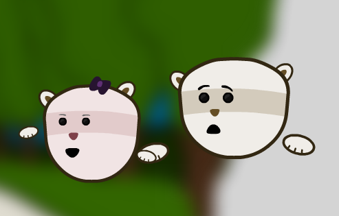
You saw the drawing of Steve, well here it is in Flash in one of the transitions in the second scene of the park narrative.
I knew I couldn’t animate any sort of walk cycle convincingly just because it’s one of those things I don’t have any patience with. So, after looking at the style of Catface like I mentioned previously I went with the floating effect.
I knew hovering would need to look deliberate, but didn’t fancy tweening every second them bobbing up and down. When working in AS2 I’d come across a rather helpful class called the Tween class. While it’s changed slightly in AS3, it’s still there, so I used that. Simple little bit of code that saved countless hours of refining the details.
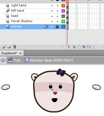
Both Helen and Steve were made as basic sprites in their own movie clip. This made it easier for me to move them as a whole on stage.
Each “angle” or part of a scene with any different sort of animation required another movie clip. It’s a small price to pay for the ease it presents.
All animation was encased in these little sprites, with a head movie clip inside an arm movement movie clip.
To cut down on work, too, I designed Steve, copied and changed little bits like skin colour to make Helen. They share the same components, like eyes, nose, hands etc.
Voices and sounds

Voicing my characters was going to be my next major concern. Verbal communication was key as it literally told the story. It wouldn’t work with just subtitles or something.
Although obviously, I couldn’t voice a male and female character myself, I needed help. But nobody wanted to play Helen, so I got some help through a voice modulator thing which turned my voice high-pitched. Lovely stuff.
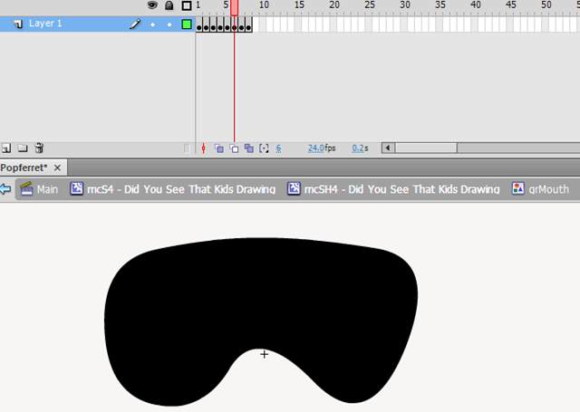
The next step was lip-syncing it all. The voices went on the timeline inside the head movie clips, so it wasn’t a problem syncing them up, it’s just a painstaking process. I set up the mouth graphic to have a mouth shape in a new keyframe. Then it was just setting up separate keyframes on the mouth layer on the head movie clip to sort out what mouth would show.
I was going to take the approach where it just looped all the mouth shapes just to simulate talking, but it didn’t look all that great. It certainly was worth the effort to lip-sync.
Set design
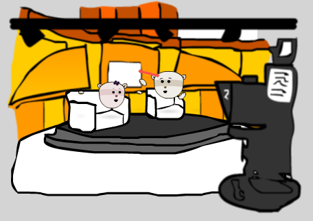
There’s only really four backgrounds that needed designing – two for each of the Studio and Park scenes. In the studio, it needed the filming side and the backstage section and the park just needed a path and a plain open area of grass. I kept it simple because I know I’m not an artist. Anything fancy I’d try to do would just not work.
Things like this set design were traced from an image of a studio an image of a studio found on Google Images of an actual studio. From this I split components such as the camera, backdrop and chairs onto their own layer so I could simulate some sort of Z depth.
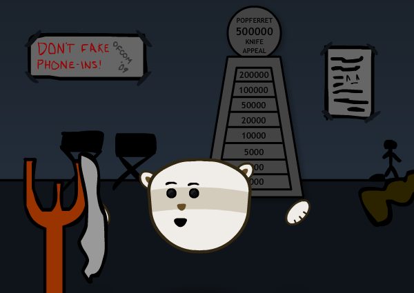
Elements like the backstage sections were done using simple lines and gradient fills. I knew I could get hung up on the detail in this bit, but I needed to keep it simple. Doing so meant I could reuse the walls for other bits, like Helen angles and when they’re heading to the park. I used posters and things to break it up and so it didn’t look the same every time.
Interactivity
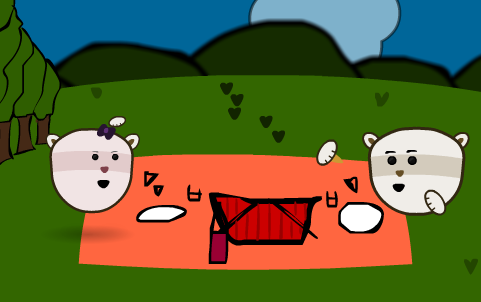
Thanks to the only bit of interactivity being lost to the time wolves, I needed another bit of interactivity apart from the Play/Replay buttons. I came up with the idea of little Easter eggs being hidden around different scenes.
For example, in the image above the cursor becomes a swarm of flies. If you click, Helen will try and swat them away. There’s things like turning studio lights on and off, running a Blue Peter-esque totaliser and finding a man on fire. Like I’d tell you how to find them, though…
It’s all about random humour with my target audience, so alongside Steve getting beaten every now and again by simple objects, there’s other bits you might not notice which just add to the subtle, yet random, humour.
So that’s Popferret. You can watch it around on places, but I’ll link you here when it’s completed alongside its Flash-based website. That could be fun…
