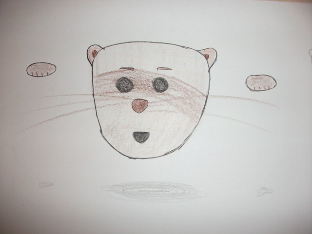
Flash animation project – Popferret main character
The next project is an animation in Flash lasting a couple of minutes. Now I’ve done plenty of work in Flash, but that’s specifically missing out animation of characters because – in all honesty – I can’t draw. So I needed to find an animation I could do without doing too much drawing by hand.
I’ve done some research into styles of animations I liked, and what I had finally decided to do was a simple, clean style as seen in many animations by Weebl and Bob:
In particular, I liked the style of the Cat Face series, in which a floating cat goes and does relatively normal things.
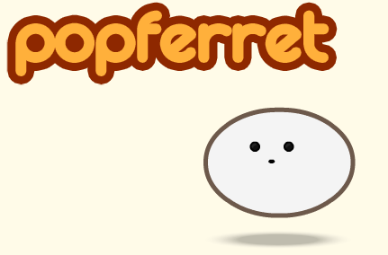
With a couple of days of thinking about it, I had drawn up a little test movie in Flash to see if I could emulate the technique used in Catface using a floating head. It was by no means the finished character, I just wanted to see what he looked like.
Soon enough, another one day project crept up and required a character style sheet for a main character. Most of the main characters look the same, but this required focus on one particular one.
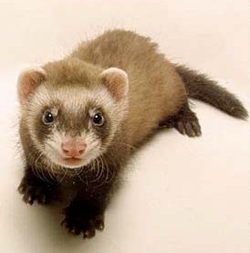
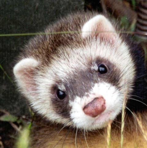
I thought I’d best do some research on some ferrets, in particular their facial shape. Their faces are generally made up of two tones – a light brown and a darker brown. Their eyes are deep black dots, with a slight glimmer. Their noses are bright pink and they’ve got small, pointy ears. Perfect little children’s TV characters.
Meet Steve.
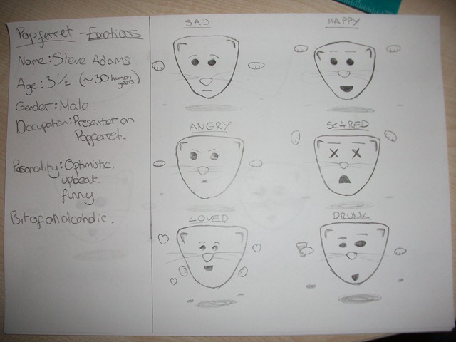
I drew up a quick bio of Steve just to get a sense of his character, and what I’d need him to do throughout the animation. In summary, he’s a childrens TV presenter with a bubbly front face, but a darker, more laddish face behind the camera.
I did a few expression shots for scenarios that are likely to come up during the animation, including happy, sad and even drunk. Essentially, however, emotion is shown through the eyebrows, mouth and hand movements. Along with things like tone of voice, but you can’t really draw that kind of thing.
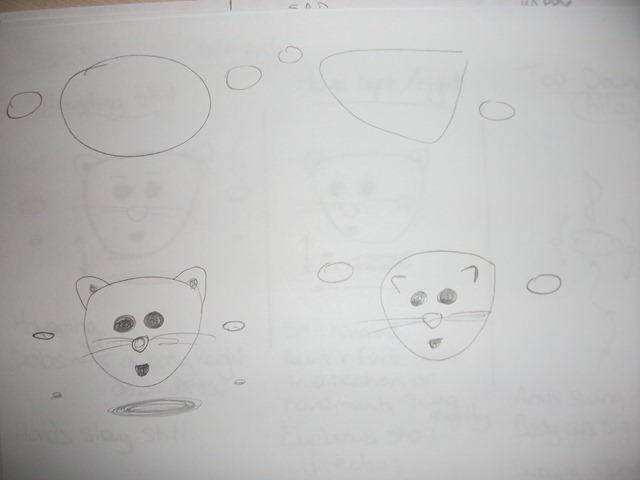
But while doing that, I wasn’t sure about the shape of his head. Previously, I’d just drawn a circle similar to the Catface cartoon, but I thought I would give Steve more definition and a more… ferret-y appearance.
After trying a few examples, I decided to round his head off more, but keep it the sort of triangle shape, and place the ears on top. The style I was going for, after all, was a kids TV style, to give it that twist of really being a cartoon for young adults.
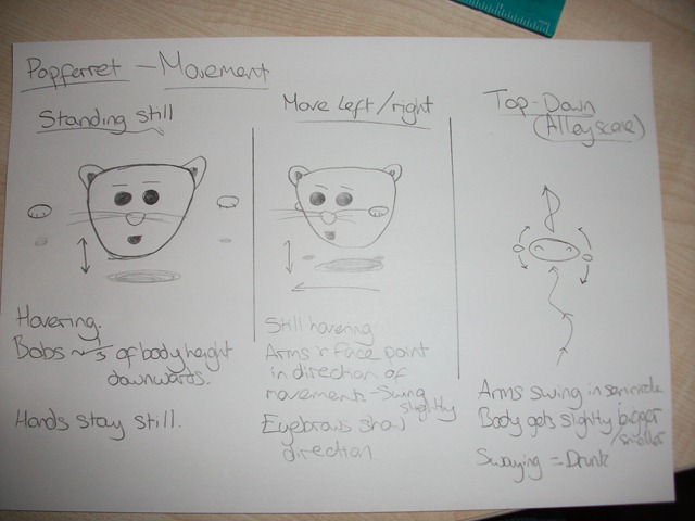
Next on the list to profile is how Steve moves. What’s unique about him is that he floats – ie, has no legs – so there’s no problems with animations of walking. But then we encounter the problem of how you can tell he’s walking a certain direction. How can you pre-empt movement in something that floats?
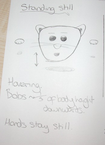
Well, let’s take a look at how he stays still to start with. He’s constantly bobbing up and down to indicate he’s hovering. His hands stay still as his body dips down.
The shadow underneath him gets more pronounced as bobs down. This shadowing could become a problem when he’s near or floating over things on the ground, but this will be addressed when it comes to storyboarding.
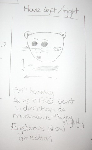
When moving to the left and right (and moving back and forward, too, but this is just shown by him getting bigger and smaller) his arms change position so they essentially point his body in the direction he’s facing.
He still bobs up and down the same as if he was stationary, but his arms now bob too and begin to curve in a semicircle.
The facial features all move to the side of the face he’s moving, and the eyebrows tilt to that direction.
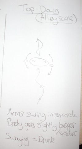
There’s a scene where he’s come out of a pub swaying and stumbling down the street. From here, it needs a top-down view of him. Here’s where a bit of perspective comes into play.
As he floats, his body will need to contract slightly to show he’s still bobbing, but it needs to be a little less smooth than when he’s quote-unquote ‘sober’.
His arms are now swinging more obviously. In bigger semicircles, which make him “walk” in a wave line like in the picture.
All of these keep the same simple style of Steve, using thick outlines and Rayman style movements.
Next in line were the colours. Like I mentioned before, they generally have a dark, chocolate brown and a lighter creamier brown in strips.
I generated a colour scheme for a different project called The Ball Game which used similar colours to this one.
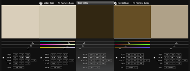
I think this will be used for the animation, but with the inclusion of a black/dark grey instead of the first sandy tone, but colours are the same.
The scenery will be different colours, so the entire movie won’t seem as bland as the colour scene for Steve.
Steve will most likely have strips of colour, with a light brown (most likely the far right colour) with a dark brown (the one second from the right) overlapping it. His nose and paw details will be coloured with the deep brown in the middle.
