Homepage and folio update
The One Day Project was the springboard into the crash-pit of ideas. While it's a brilliant idea to get you thinking, it's not exactly a time where you come up with your best ideas.
For me, I know it takes a while of fine-tuning some ideas, then completely rejecting them until I come up with one I like. So I've started off that process by creating a fresh idea for a homepage and editing my original idea for the actual folio site.
The Homepage
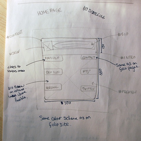
What I want my homepage to be is essentially a quick landing-site for anyone who wants to find out more about me (and who wouldn't?). So I wanted it to show them how to get what they most likely want, but at the same time showing off my design skills.
I was trying to keep it simple. That's the main aim. I don't want cluttered, unnecessary information bombarding the visitor from the off. I want them to see exactly what they want and nothing more. So I did a little design:

The idea is simple. Have a simple, non-scrolling page which just sits a box, roughly 700 by 550 pixels, with a short bio at the top and just links to the various places off of it. There will be 6-8 links going off this page, with the main ones being at the top and down the left hand side. When the user hovers over one of the links, the background image of the box will change in correspondence to the selection.
The idea being that the user can get an impression (and hopefully a good one) really quickly and effectively without going to visit any of my pages fully.
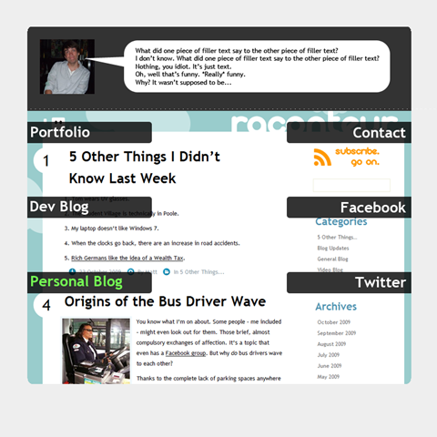
Obviously, colours aren't set as I'll want them to be similar to that of the final portfolio website design. But here's a quick Photoshop mock-up of what I'm trying to aim for:

I think it needs something like a gradient or gloss finish to make it look a little better, but the navigation's very much in the style of the Channel4.com website.
Update the Folio Page
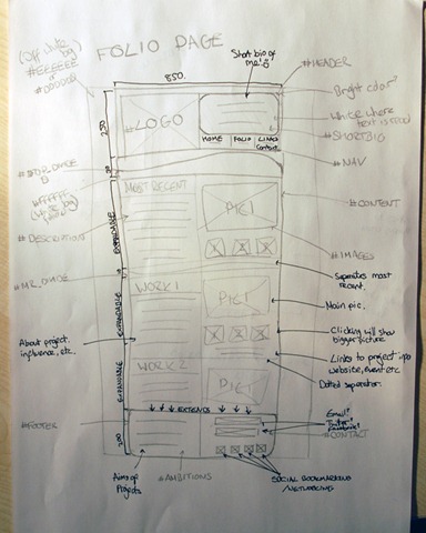
Not being happy with the outcome of the Photoshop mock-up from before, I went back to basics and drew another design. This one's similar, but isn't as noisy and mismatched as the other one.

While it still has rounded elements to it, most of them aren't completely round like the pictures were in the first concept. This new design seems a lot more space-effective than the last one, which left quite a bit of white space.
The header and footer will carry some of the design elements through from the homepage, which I hope will become tightly linked to each other by design.
While this idea is very much still a work-in-progress, I'll leave it off of Photoshop until I've got more of an idea in terms of content and scalability. However, I do have some sort of idea about the CSS involved in this design, so I could get wire framing for the actual layout in HTML soon.
