One Day Project – Conceptual Development of the Portfolio
At our university, we have these little challenges they'll set us called One Day Projects. It's not hard to grasp the fact that each challenge is – indeed – one day long. You're set some sort of brief and you'll need to use your quick thinking skills and design tips picked up through lectures and seminars to gear yourself through it. The brief was to develop a concept for our portfolio site, which will eventually be on the homepage of MattCrouch.net. We'll need to find one website which – along with some other source of media – will give some inspiration for a graphic design concept.
THE INFLUENTIAL DESIGN
Following some work in the workshop talking about portfolios, I did my own research on the type of thing that needs to be going on within a media design portfolio. During this research I found a portfolio created by a guy called Danny Blackman at his site [DannyBlackman.com][danny blackman].
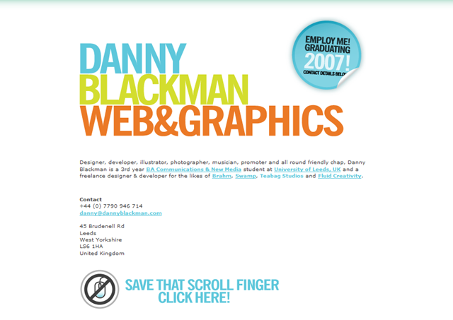
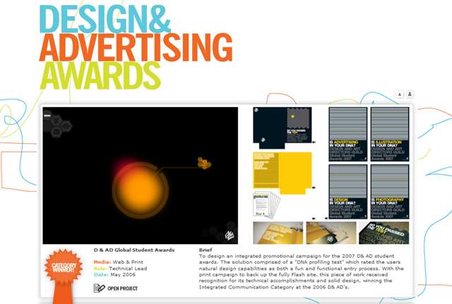

What I found inspirational about it was the fluidness of the whole design. If you go onto the site, all of his work is on one page, separated by more of his work in graphic design. The layout was clear, bright and smooth. There was no need to click, either. The JavaScript at play moved it all through for you, like a slideshow of his work.
It's essentially a bold and colourful show of his work and it goes "Bish, bash, bosh. Here's my contact details. Get in touch." and I thought that was a style that could really work.
Another idea which had caught my eye for a while were the style of some YouTube videos I had seen from a while back. They are typographic animations, where text is usually animated over an audio clip from a song, film or inspirational speech for example. The idea is to get fluid movement using the words of the audio to drive home its message, whatever it might be. Here are a few examples:
All of these share common themes that I mentioned with the portfolio website mentioned above:
- They have bold lettering which helps them stand out and grab your attention. This would be especially useful on a portfolio website to grab your potential employer's attention with key words.
- The background is kept plain, with a slight gradient if anything to give variation. This is keeping in tie with the point above, as it brings out the most important elements if you have a clean and concise background. It looks more modern (think Web 2.0) and you're more inclined to come off as 'in with the times'.
- Movement is fluid throughout the videos, as it is in the portfolio design. Without a fluid design within the site, you'll either come off as someone who's not very strong in the field, or hasn't taken the time to care for the viewers.
- Everything seems important. There aren't any parts which are made small to whittle into insignificance. With the technology we have now, there's no need to shrink images down to the size of an ant. Bigger seems to be better - from a web design perspective anyway – now we've reached Web 2.0.
I particularly liked the last video, Typolution, where the the designer Olivier Beaudoin used simply letters and punctuation to create a design. It seems fresh and clever idea, and one which I will try to incorporate into my designs.
THE GRAPHICAL CONCEPT
With inspiration in hand, it's time to get cracking!
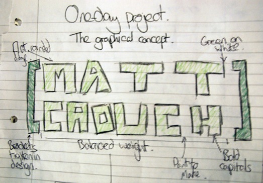
I started out sketching whatever design simply came to mind, but my graphical concept came out to be more my name for graphical impact. In a similar style to that of Danny Blackman's portfolio site, it was to have bold lettering and stand out in the top left, to draw the reader's attention straight to it.
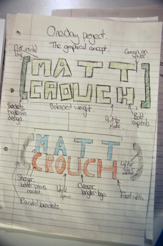
I created an original design, then the refined one underneath after I'd taken in some ideas brought up in a recent lecture about the elements of design.
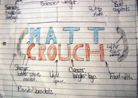
The first design turned out to be perhaps a little too striking and threatening. Being only freehand and with a little bit of colour, it was difficult to see how it would turn out on screen, but I could tell immediately that the square brackets and flat edges were not something my design should really incorporate.
I did quite like the idea of the fixed width of the lettering, so it could stand out more. The white space in between the letters – especially on the first line – would bring out the colours in the design and make it more visually appealing.
So I refined the idea to bring in the elements I liked from the previous designs. The colours, the smoothness and the vivid nature of the colours turned my somewhat monochromatic affair into a triad of colour. Rounded brackets were used to give the design a more round, less militant look to it, similar to that of the Red campaign. The fixed width remained to make it look clean, but the lettering was made slightly thinner and allowed to be sort of rounded. This design was made to make it look a little less threatening as the first thing you see.

I brought the design into Photoshop to mix and match different colours. This is the best combination I tried. The original mix of three opposing colours didn't work well, so I chose a dark grey and then two bright, opposing colours. Obviously, this had an impact on the site, which you'll see below.
EXAMPLE HOMEPAGE
With the graphical concept in mind, it's time to draw out what the portfolio website could look like. Taking in what I'd learnt from the influential designs, as well as my own knowledge when designing my personal blog Raconteur, I drew a quick sketch on paper to get a reference point to start off with.
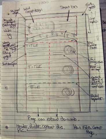
It's designed with the 'average user' in mind, with a screen size of about 1000. The overall width of the site will probably be around the 800-900 mark, with expandable sidebars so the content stays central.
From my own research in the web design stakes, user focus is generally in an F-shape on the page. First they'll look in the top left, then top right, then down the left hand side. My aim with the design was to grab the reader's attention at each of these points. The top left would be the concept design I made previously, the top right would then be a short synopsis of myself, with links to the other pages underneath it.
Finally down the left hand side will be the titles of all the projects I've been involved in, most likely in a heavy type, with a short synopsis of the project and a link to where it is or would be used. Circular screenshots will be used to break up the linear fashion of this (and almost all) web pages.
All entries into the portfolio will be broken up by a single dotted line – probably of a colour relating to one in the concept design – to signify clearly where one entry ends and another begins.
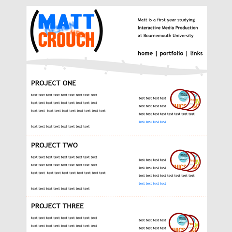
After playing around with the design in Photoshop, this is the design which came out. As you can see, the colour scheme changed slightly from an earthy green to a light grey, to bring out more of the colour and make the design not feel as closed in as it may have been.
The concept design is really the first thing that catches the eye. With more text in it, hopefully the short paragraph to the right of it will draw the attention second, but for now second focus remains on the picture circles. Again, with more surrounding text, this might become better positioned.
However, this is the nature of development. If at first you don't succeed, try try again. I'll be no doubt revisiting this project in the near future, where I'll readdress these issues before coming to the final design later on in the year.
