Pages from Me-fax
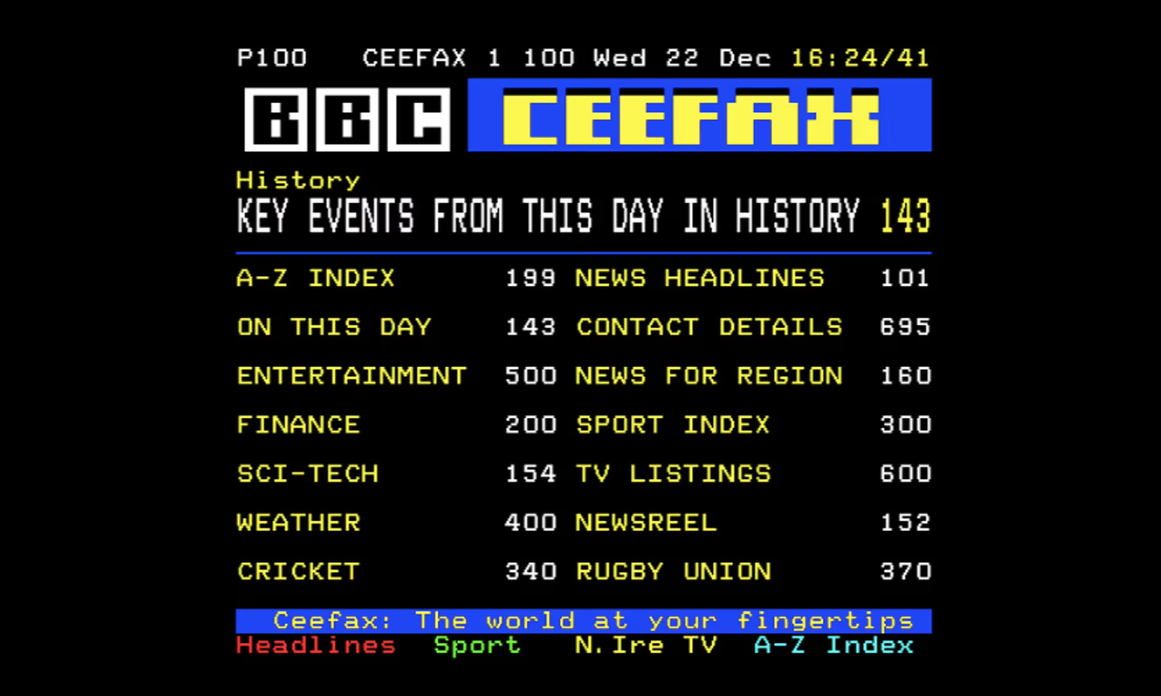
Remember Ceefax? Even if the name doesn’t ring a bell, you’ll probably recall the bright, blocky text and painfully slow loading times. Back in 1974, how else were you supposed to check the latest football scores - wait for Match of the Day?

There’s something charming about its simplicity - delivering just the information you needed in the most efficient way possible. Within those limitations, people still got creative. Heck, we got Bamboozle! (yes I know that's technically Teletext - don't write in)
I've long had the idea that I wanted to create a website that used all the newest front end techniques to create a really low-tech result. I'm talking MIDI covers of the latest songs generated in-browser, WebGL spinning letter email icons, and star wipes with the View Transition API. Maybe even server-rendered if we're going totally retro...
After updating my website back in 2023, my homepage has stayed as the same placeholder ever since. It's just been waiting for the right design at the right time. I've had a few goes, but nothing's ever quite clicked. It has been perpetually under construction. Perhaps I could dig out that old GIF.
So yes. Of course my homepage has to be Ceefax.
I mean - look at it! It's got blinking text and everything 👌
Grid and Sub-grid
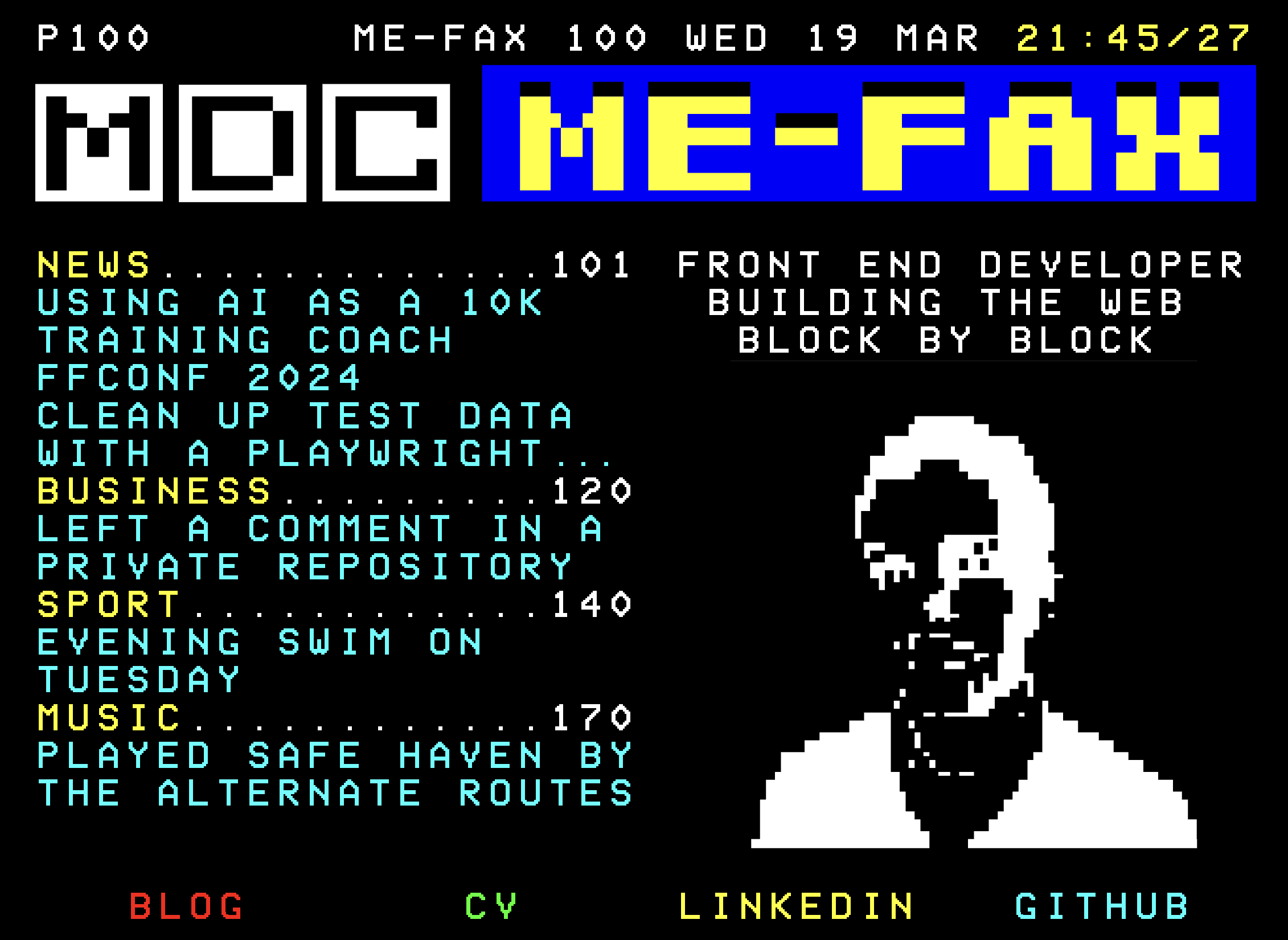
Everything is lined up as you'd expect. It's 4:3 - 40 rows and 24 columns. Exactly the same as the Teletext specification. It all lines up exactly as it would have done on your old CRT in the 70s. But that's a lot harder than you'd expect on the web.
Normally, I’d let content flow naturally, but here, everything had to align perfectly with its assigned row and column. Otherwise it would look completely off.
That's where display: grid comes in. The containing page is split in to a 40:24 grid, with typed custom properties defining the spacing and every section aligning to that grid. The font is sized with fractions of a cqh unit, making sure the characters only ever align with the grid inside the larger container that forces the aspect ratio. Some clever font spacing makes sure that the ModeSeven font doesn't misbehave and break all the hard work.
Everything is split out into sections, but that means that it would normally lose the alignment provided by the grid. By using display: subgrid I was able to keep elements like the footer links using the existing grid rather than having to repeat it throughout the page.
Accessible by default
Sure, I could have just drawn everything onto a <canvas> and called it a day. That would have been easier - but also a nightmare for accessibility. And honestly way less fun to build.
I lent in to the blockiness with some of the styling. The links will just invert when selected and I feel like they're all clearly clickable and intentional. Be thankful you don't have to navigate with a remote (but if you do, everything can be navigated to without a mouse anyway so you'd be alright)
However colours are fairly limited. You've got red, yellow, blue and green for the most part. No shades, no styling, all the extremes. Blue is used regularly, but pure blue on a pure black background is incredibly difficult to read, so I switched that out for more of a cyan colour instead.
Social data stream
The left side contains a list of the latest blog posts plus a few updates from me around the web. Each one is clamped to only ever show max 2 lines using line-clamp, so that we can be sure there's always enough space for everything to fit.
II’m a bit obsessed with the quantified self - all those ad-tracking/data points floating around online, just waiting to be used. So why not put them to work here?
Right now it's pulling in GitHub, Strava and Last.fm data and displaying the page with Next's ISR page generation. It's not the most clever at the moment but it will at least only pull in data as it needs to.
I plan on doing a bit more in this area eventually, but it's a good place to start. I'd love to have just a single stream of me online, and all of the narcissist/nerd points that brings with it.
Ceefax yourself
The right hand side is a little bit of a filler. I wasn't sure what to put there, but settled on a blinking header for that retro vibe. This is just a CSS animation, but it channels the energy of the web that <blink> once demonstrated many years ago.
The image is just the (depressingly old) photo of me passed through an Image to Teletext tool, which is a thing that exists.
It generates an image that is intended to actually be used by a Teletext decoder and sent to be broadcast, which is way more fancy than I need. Thankfully SVGOMG is back to save the day. It's converted an image that was several KB down to just a few bytes. Just as Ceefax would have wanted.
This was mostly just an exploratory exercise, but I ended up loving it. It's not my permanent homepage, but it can certainly fill that void in the meantime. I would miss it too much to just kill it, so I must find it a home to live on if that happens. But of course, going by my track record, websites might seem like a throwback by then...

