Kinect and it’s usability issues
Kinect’s just over a year old, now. Despite earlier this week Microsoft telling us they sold 18 million units in it's first year, scenes like this are all too familiar...
This guy is using what looks like Microsoft's Worldwide Telescope project that was hacked together to demo the Kinect SDK back when that was released. Okay, it’s not designed to be used with Kinect, but it’s not the most intuitive thing in the world. When people use Kinect they’re expecting Minority Report, not Karate Kid.
Reinventing the wheel
The problem is simple – we’ve been pointing and clicking for decades now. It’s gotten to the stage that kid’s practically come out the womb knowing how to use a computer with a keyboard and mouse. But now with Kinect we’ve done away with that. We’re reinventing those predefined norms. You’re learning to ride that bike again.
I say it like that because after a few goes on the Kinect you generally "get it" again. There’s a horrible generalisation going on there (we’ve all taught a relative how to use the Internet, right?) but really you’re using your body to invoke things on screen using natural(ish) gestures.
The Natural User Interface
The problem we have now is what norms we have people "get" now. If you’re on your computer, you click on an image of a folder twice and up comes the contents of that folder, where if you type something and then click the image of a magnifying glass it will find what you typed. We have expected behavior to our actions even on systems we’ve never used before.
Studies Done around the time the Kinect first launched revealed this problem head on. This research – done using 10 players of between 22-45 years old with differing gaming ability, but all lacking experience with the device – found that within the five games they tested out, there were four different user interfaces. You need to relearn an entire way of interacting between each game. While some of them explained their UI on first load, most don’t. A lot of people were trying to push in, or click on, each menu item.
Should clicking be the standard across every device we interact with? Not necessarily, but the principal should be. The user should make a conscious decision to choose a menu item or not, which is a little difficult when we’re talking about the Kinect as – poor thing – it’s trying it’s best to guess where you are in 3D space. It’s not a mind reader.
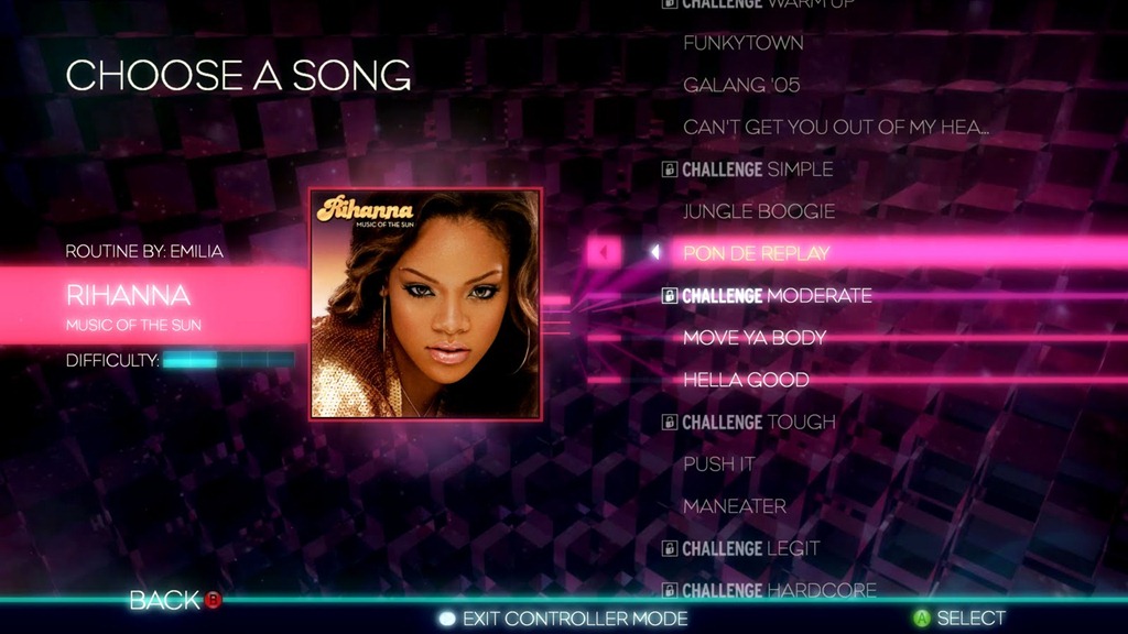
A lot of false positives were recorded in that test, especially with Dance Central’s UI of swiping to select. To me, this seems to me like the ideal solution to a game with long lists of things such as songs and it seems in their testing that they agree too. But when the last game you were playing asked you to hold your hand and hover over an icon, trying to do that here is either going to select something if you’re using your right hand, or get you absolutely nowhere if you’re using your left. Swings and roundabouts, I guess.
Learn from your mistakes
But you need to remember one thing – all the titles discussed so far have been ones that were released alongside the Kinect itself. These people had little idea what their competitor was doing, nor did they know how the public was going to take to this new system.
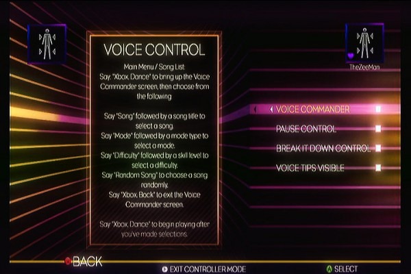
Dance Central 2 did a bit more to educate the public, as well as give the user a newer way to navigate through the use of their voice. The voice navigation on Kinect is pretty accurate as is and has developed the norm we’ve had drilled into us either through use of the new dashboard or through their advertisements of "Xbox" followed by naturally worded command like "play" or "start". Dance Central 2 takes the name of the song, the mode and it’s difficulty all in one sentence for you and it actually works pretty well.
Too much engagement
[Neilsen][neilsen - kinect posture and ux] did his own research into Kinect usability around the time it came out and garnered a lot of interesting tidbits about getting the user’s to pay attention to feedback.
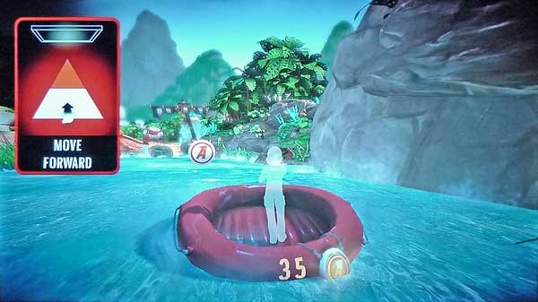
Kinect Adventures is a classic example of user problems and feedback for them. The player, in all their excitement, has moved out of the prime range of the Kinect sensor. If you’ve ever played River Rush, then you know that happens more times than you would like. But quite often it happens during an important bit and you’re focusing on your little character and their dinghy making sure they get the coins, not a box in the top left corner.
Okay, it’s fairly difficult to completely miss, but the point is that the player’s focus is on the dinghy and it’s immediate course forward not anything else. I can only assume that’s why they decided to place the credit counter on it. If the purpose of that alert was to make the user take immediate action, you need to put it somewhere near where they’re focusing in a fairly intrusive way. Arguably the ghosted version of the player serves this purpose, but it’s only telling you you’re not in the focus, not that you’re too far back.
Focus isn’t a Kinect-specific problem here. It’s something game designers (should) have been tackling for years now. It’s kind of a lose-lose situation. If you make your game too immersive – a lot of which Kinect games are – they aren’t going to notice things at the sides. It might as well not be there.
For Moto I’ve devised my own usability testing practice to achieve an answer myself. Is it quicker for players to follow instructions based on their position on screen, or a consistent place on screen? There will be more about it in a later post but it tests Neilsen’s ideas to their limits.
And that’s where I’ll leave this. No doubt looking back on a year’s time we’ll have solutions to all these problems, but until then we’ll keep having to grind down this block of wood until we’ve gotten a wheel...