Designing a Legoland App
And so it begins. Choosing an angle for the app. You've got to look at different elements of who you're designing it for, what they would require and how best to present that information. So I did just that in a brainstorm like all the cool kids do.
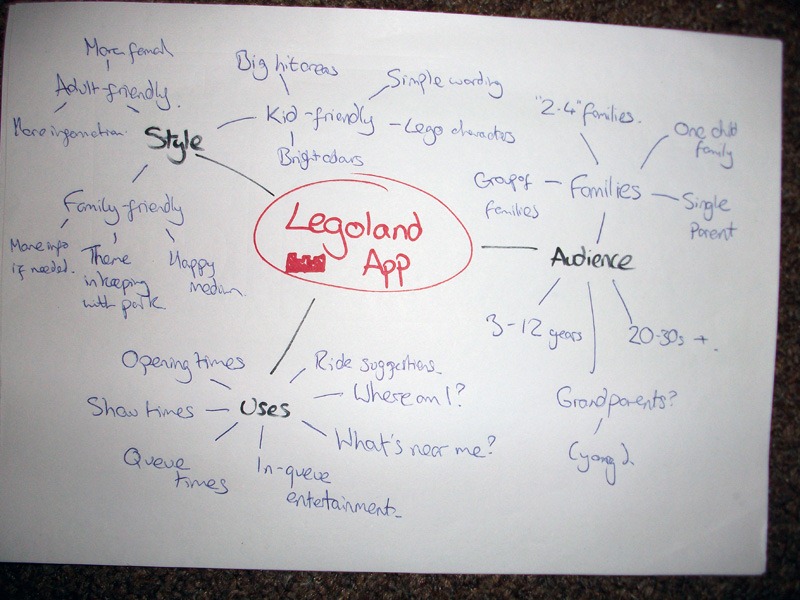
First off I looked at the audience – who might use this app? I came to the stunning conclusion that it could be just about anybody, but mainly it's going to be one of the two parents of a family, typically. You'd be brave to go to Legoland with just the one adult, let's face it.
Then I looked at what features could be useful within Legoland. They've got a few shows going on and it's chock full of rides, so I thought of all of those ideas mainly a "Where am I?" app which finds where you are in the park and suggests stuff you could go to that's close by.
Finally, I looked into the style of the thing. Taking in mind who's going to use it and what they'll be using it for, I decided it needs to be all big buttons and finger-friendly, but with a more childish angle. Kind of like Legoland itself. Fun for all the family, as they say.
First drafts
So I gave designing the app a quick whizz through on pen and paper just as ideas were popping in my head from previous apps I had designed.
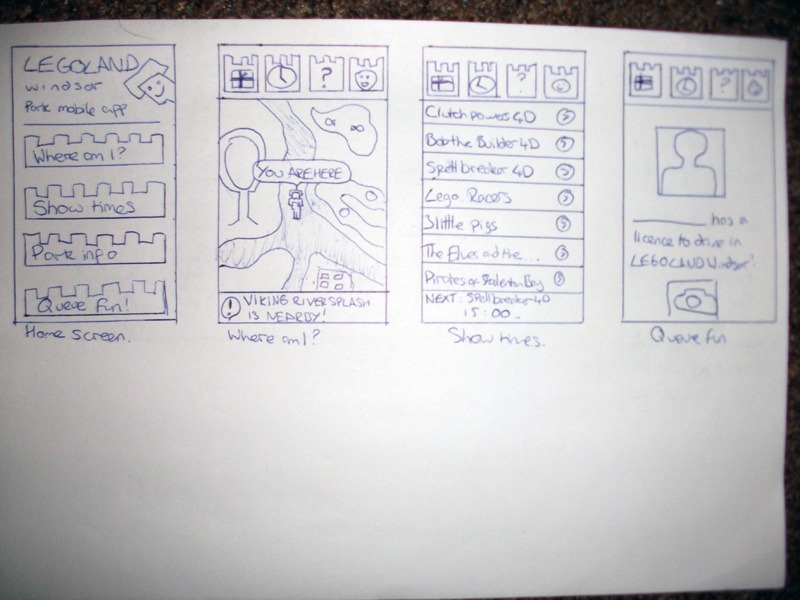
This was at a time where I was really trying to bite off more than I could chew. I was targeting Android as that's really all you can do without a Mac to work on, and I have an Android so I know the general design principles for them. They aren't as hard-and-fast as iOS apps, but there's some there.
While I got a general idea of how this app was going to look, it all looked a bit… cluttered. Too much going on. And that's certainly something you don't want from an app that's supposed to help you when you're trying to look after unruly children. So I gave it a rethink.
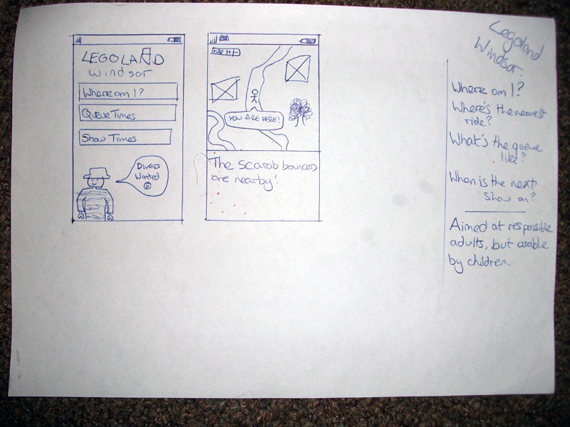
Second draft
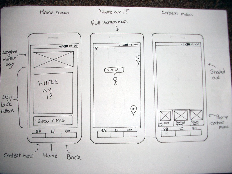
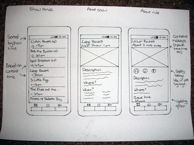
The best way to prototype is on paper, right? But you don't really get to feel what the app would be like from just a box, so I added a pretty generic Android-y device around it (which kind of takes the look of the Xperia X10, but that wasn't intentional).
So now it's a whole lot easier to navigate through the app and see what it does. You hit the giant 'Where am I?' button to… well… see where you are. And it'll show you all the nice rides and attractions around you, including what the queues like, so you don't trek all the way there just to wait for two hours. If you click the 'Show times' button, it'll show you the show times in order of when they are being shown. Clicking either a ride or a show time will tell you more about it.
And that's about it. We only have a couple of weeks to make the thing, so we can't be too full on, but really I need to start making the thing now. I've had a few problems finding the right platform to develop on that supports geolocation easily, but that's for another blog post.
See you on the other side, with any luck!