A redesigned 1000words
So Christmas is over. Time to get back to the grind, I guess. There's been an update to Spaced before this one, admittedly, but I'll tell you more about that when there's more substantial an update.
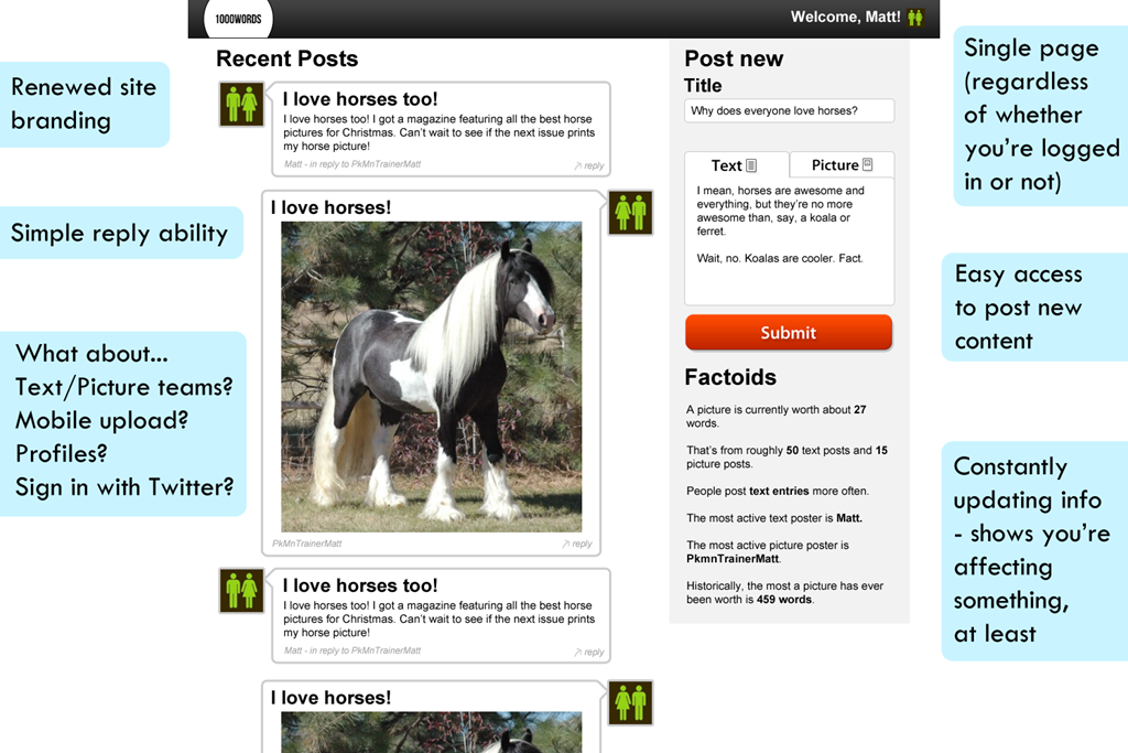
I took what people suggested on board and thought "Y'know, the design as it currently is isn't very flexible. It's all a bit everywhere. It needs smartening up". So I did just that. (In Photoshop, currently, just as I play around with positionings)

## What's changed?
Okay, okay. Let me just take you through a few things and why they've changed…

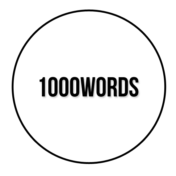
First off, it's got a new logo. Right now you don't really see that anywhere on the site apart from a chopped off version in the top bar (what will become a navigation bar of sorts). Before the last one wasn't really functioning as a logo, it was just a couple of bits of text overlaid over one another. This one's just somewhat smartened up, and is pretty flexible.
The idea behind the look of this logo is that it can be put into many different situations, as it will be later on. Firstly, it's a quickly identifiable logo. Secondly, it can be used as a button (for example, on iPhone home screen icons), can be used as a user picture for official messages (as it's nice and square) and lastly it can be changed colour to fit different settings if it ever needs to be.
But enough about a circle with some text in it, what about the other changes?
Firstly, there's the redesigned posts. Before they were in two separate columns, but it gave the feeling there's two different kinds of content (which there are) that don't interact with each other (which they do). Now they're just sorted in order of which they were posted. As before, you can reply but now it's more streamlined. Hopefully it'll be able to pass info about what it's replying to straight to the form without requiring a page refresh.
There's now a sidebar, which contains the posting form. As you scroll down the page, the form follows, allowing for on the fly posting and replying, which is the aim. The problem before that just looking for the form to post something was enough of a deterrent not to bother.
We've also got some factoids. Not really a feature, as it doesn't add anything per se, it's just interesting to see how it's all worked out and give some credit to the people who post the most.
## What still needs to change?
Well, there's still no real individuality on the site. Sure, you can upload a user picture and reply to your friends, but there's no real profile section. It wouldn't be too bad to do, but it's not a priority. It's top of my B-list.
Still no mention of mobile uploading. Although I'm hoping the normal site will still at least function on iPhone if not anything else until I get a chance to do that.
Point scoring – It's not really there any more. Grew out of favour with the idea. It might make a comeback if I can tastefully put it in somewhere.
But yeah. Next step, redesigning the PHP. Awesome. So much fun…
