Cutting out a photo in Photoshop CS4
With an ever impending need to find a placement for the upcoming summer in interactive design, I needed to make myself stand out a little bit. I got thinking and ended up taking that a little too literally and made myself stand out.
If you want a go at editing a lovely picture of me, I've given you the full size .JPG file, a .PSD of the finished thing and a .PNG of the final outcome transparency and all in a handy .ZIP file in my experiments site.
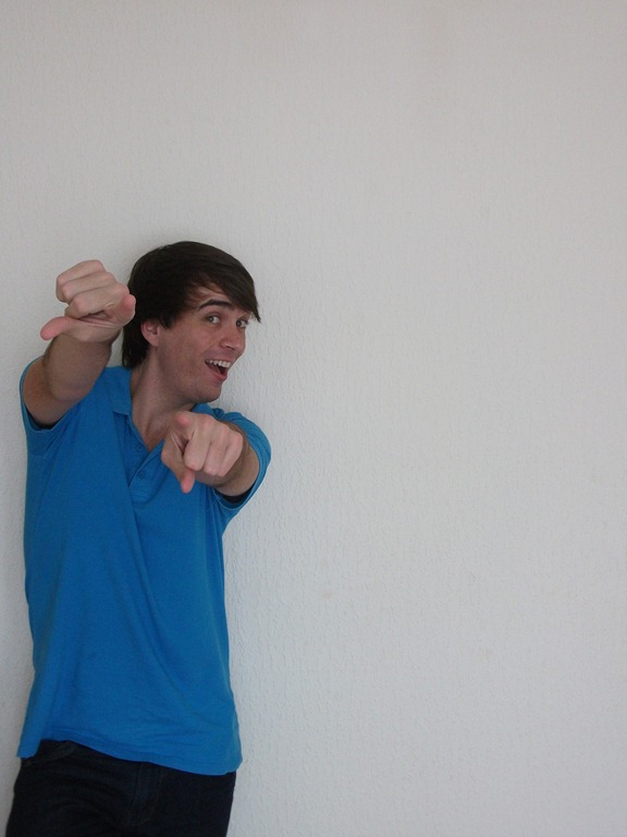
So this is the file you've got to work with. It's from a group of them I did way back when for my Student Hour on Nerve Radio. They stayed on my memory card because I was sure I could do something with them at some point.
The problem with it is that it was done against one of those textured wallpapers you get, so it's a nightmare of light and dark greys. It's not going to be a straight forward 'magic wand' job which I would usually. So I dived head first into the mask arena.
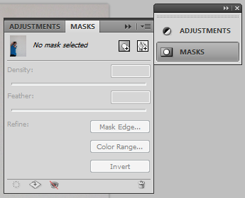
Open up the original .JPG in CS4, make sure the picture layer is selected and open up the Masks panel (That's Window > Masks). There's a small square with a circle in it called 'Add a pixel mask'. You're going to want to click that one.
While it won't look like it's done anything, it's given you a couple of sliders for density, feather and some buttons. We'll come to what the sliders do in a sec. But what you really want to play around with is the 'Color Range…' button. It will choose what colour you want to mask out based on what you click or, if you're so fly like a G6, a basic colour palette.
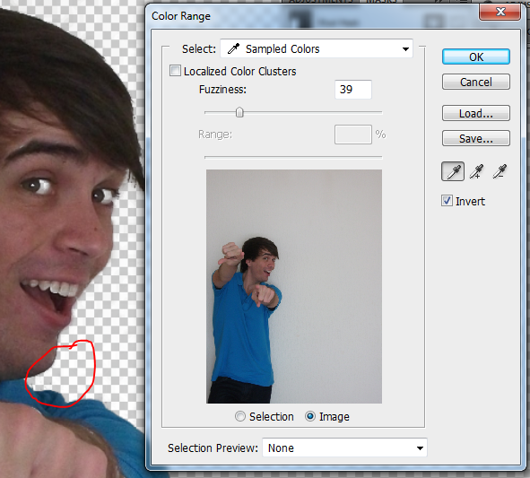
First thing you're going to want to do in the Color Range window is check the 'Invert' box. So then you'll see my lovely, not creepy in any way, smiling face. It will most likely have some transparency on my hair for whatever reason, but it's pretty easy to remedy. What you're doing now is sampling colour in the picture (either in the main window or the preview in this one) to mask out. Hold down shift or use the appropriate dropper buttons to select both a neutral colour on the right hand side and a shadow one (I chose the bit just under my chin). You'll notice bits of my eye and teeth go transparent too, but we can sort that out in a bit.
Finally, hit OK and we'll jump back to the Mask window.
Those sliders I mentioned before? Here's your chance to play around with them. Density is essentially the opacity of the mask, so really should be kept at 100% for this. Feathering just blurs the edges a bit. It's really there if you don't want to spend ages smoothing edges, but it does give that 'cheap photoshoot' kind of look it all, so it's entirely up to you. If you do use it, don't go past 5px.
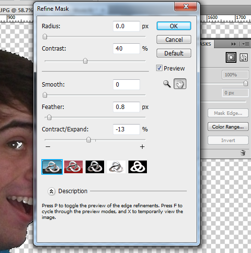
Time to refine the mask! Click the 'Mark Edge…' button in the Masks window and it'll come up with a few more sliders. Feel free to play around with them, but it's best to use the values in the screenshot to the left.
Contrast is probably the one that makes the biggest difference here. We want it lower so it doesn't pick up a fuss with the loose hairs at the back of my head (well, any more than it has).
To see what's really going on, click the left-most little squiggly thing of the five in the window. It defaults to showing it against a white background which, since we're cutting out white, doesn't really help us much.
Finally, hit OK and get rid of that Masks window. It's only going to get in the way.
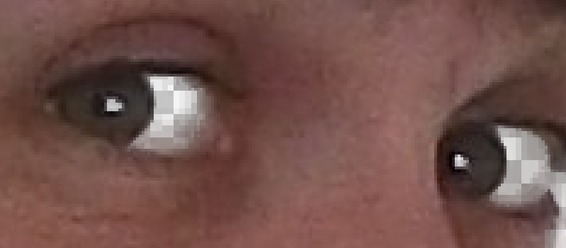
You'll notice now we've got a problem. We told it to get rid of the white, but now it's gotten rid of all white! We need to manually edit the mask to get the little bits right.
If you've ever used masks before, you'll know how they work, but if not, here's two things you'll need to know. One, it uses the colour black to denote what to mask out and two, it uses white to know what to keep in.
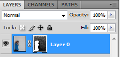
Go to your Layers panel and make sure the mask layer is selected (that's the black and white one, obviously, linked to the main picture layer), reset your colours (that's done by just hitting the D key) and make sure you've selected the Brush tool (that's just the B key) and have white as the active colour. Then just brush over the eyes, teeth, and anything else on my person which shouldn't be transparent.
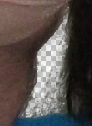
Finally – and perhaps most laborious – comes the remasking. We need to look over the entire image to make sure there's no funny looking flicks and stuff left over. Switch to the black colour and find a left over bit (most troublesome being the gap between my right wrist and neck) and just paint over it. Use quick brush strokes, zoomed in with a small brush size and check the full view of the image often to make sure I don't look like a bricky, lumpy robot. Well, more so.
Then you're done! You can play around with the levels like I did (which you can see in more detail in the PSD) or just keep it how it is. You've just essentially created a cardboard cut-out of me. Please don't include me in any sort of stupid promotional stuff. If I see myself in a shop window thanks very much.
