Portfolio redesign – Typography
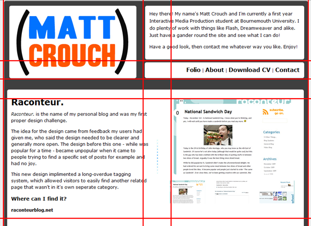
As time moves on, you’re most likely going to get bored with the designs of yesterday. It happens. Time moves fast, especially when you’re learning new design features every day. It’s time my portfolio got a little bit of a facelift. But what to do?
My original idea for a redesign was to steer more in the direction of typography. This was the aim for the current design, but restraints on meeting a specific deadline meant that I couldn’t achieve what I wanted.
Now I can take time over the design, I’d like to have a more open feel to my portfolio to emulate spacious, modern design, unlike my current one which is all box and no freedom.

After reading about upcoming redesign of the BBC website, I learned the importance of simple web design - involving grids and workflow – but also the growing trend of clear, typographical layouts in the arena.
The things I took out of that post are, like I said the importance of clear design, but also little things involving using bold colours to highlight only important bits and using pictures to emphasise certain points. The current portfolio layout is text-heavy in a bad way. I originally wanted it nice and spacious, but it’s all clumped together. Bad times.
I did some research of some typographical websites and how they made it work and outlined some underlying themes:
-
Generally, typographical websites use a neutral colour scheme, but use fleeting spots of colour for emphasis. A good example of this would be ILoveTypography.com, where they use green to highlight headers and other call-to-action areas
-
Icons accompany text to break it up. From simple designs like the company’s logo to more complex doodles like on Carsonified's website. It helps the visitor read the text, as large bodies of text can be off-putting. Things like this are necessary if a site such as a portfolio site is to be effective.
-
Textured backgrounds can make all the difference. They break up what could otherwise be considered a relatively bland layout. It doesn’t necessarily work with paragraphs of text, but perhaps as a background to the page wrapper, maybe. WhatALovelyName.com uses this to their advantage to carry across the cute styling their site is designed for
So now all I need to do is mash these ideas up and come up with some sort of concept which will hopefully work better than my current one does. Simple criteria not already mentioned are things like easy navigation to past work and contact details, continuity through parts of the site, easy navigation, a clear emphasis on what’s best on the site and naturally just looks good no matter how you look at it.
Let’s see how that runs...
